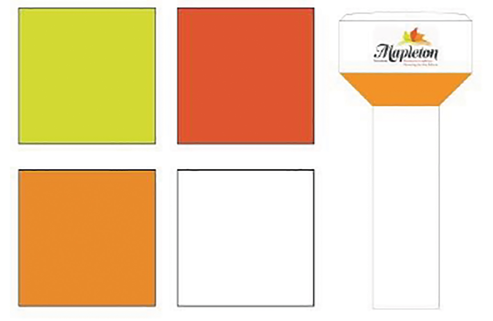
DRAYTON – Mapleton residents will get a say in the look of a planned new water tower in Drayton.
At the March 23 township council meeting, economic development coordinator Aly Cripps explained council decided in 2019 on the design of the township logo to be placed on the tower, which is targeted for completion in 2022.
“It has been two years since this and we believe the design should be reviewed again, this time with public input to engage our citizens,” Cripps states in the report.
“By creating a short survey for our residents to choose their favourite design and look of the water tower we can create excitement within the municipality about the growth and advancements happening within Mapleton.”
Respondents to an upcoming survey will have a chance to win one of three $50 gift cards for a Mapleton business.
“We’re all very excited about this water tower coming and we really want to bring that excitement into our community,” Cripps told council.
Pointing out a water tower “is a big statement piece in the municipality,” Cripps said, “we really want to ensure that our residents have a say in the design and look of it.”
Mayor Gregg Davidson said, “It’s a good thing for our residents. They’re going to have some fun with it.”
The mayor added interest about the project among local residents is high.
“Residents ask me, ‘what about the water tower? When’s that happening? Where’s it going to be? What’s it going to look like?'” Davidson stated.
“So I know there’s excitement out there.”
Councillor Paul Douglas questioned the inclusion on the survey of an option to wrap the town logo around the tower, as opposed to placing it on one side only.
“Is there any cost implication to any of these decisions? If we wrap it around the water tower is it going to be more expensive?” Douglas asked.
Public works director Sam Mattina noted when the issued was discussed in 2019, the cost estimate was $15,000 to $20,0000 per logo, so the cost to place the logo on two sides of the tower would be twice as much as one side.
Douglas and councillors Michael Martin and Dennis Craven agreed the logo should be kept to one side, and Davidson directed Cripps to remove the “wraparound” option from the survey.
The survey also asks residents which of the three colours in the Mapleton logo they wish to see on the underside of the base of the water tank.
“The only concern I would have is that two of the three colours are different shades of rust and on a water tower it makes it a little awkward,” said Martin.
“A rusty water tower that’s brand new – it just kind of jumps at me.”
Mayor Gregg Davidson asked if different colours could be added to the survey.
“I don’t see why not. If you guys would like to add colours we can always ask the question,” Cripps replied.
“I do like the idea of adding blue, as blue means water,” suggested Davidson.
“I think I prefer the colours as they stand, partly because they already match the Mapleton logo that’s imprinted on everything else,” said councillor Marlene Ottens.
“And I believe those colours were chosen partly because they’re the colours of the maple leaf, which match the Maple-ton and they are the colours of growth.”
Ottens added, “I guess one man’s rust is another person’s red or orange. So, to me, they are the colours of things that grow … so the greens and the sort of the harvest colours … I think that was the kind of image that Mapleton was trying to project with that logo.
“I think if you start adding too many colours in and too many options … I think you get lost in the weeds there. Although I guess no matter what the results are, we’re not bound by any of them, so it’s just gathering public opinion. So, heck, throw pink and purple in there – I bet we’ll get votes for that.”
Davidson noted, “We are just talking about the underside of the tank itself.”
“The logo’s there, all the colours of the logo are going to be there already. It’s just a matter of a highlight underneath.”
Douglas said, “I’m not a colour guy. I don’t have any preference.”
Martin stated, “I have a full appreciation of where the colours came from and that they match our logo and why we have them. But I can also promise you that they were never thought of as going on a water tower when that concept was created.
“I would suggest that the majority of the people who will be driving by and viewing said water tower aren’t going to know where the colours come from.”
He added, “I’m like Paul. I’m not a colour guy. All I know is that it looks like rust and it’s a brand new water tower.
“But I’m honestly not going to lose any sleep over the colour. I just thought it might be something to think about.”
Council agreed to add a shade of blue, to be selected by Cripps, to the list of options and approved moving ahead with the survey/contest, which will be launched in conjunction with the issuing of a request for proposals for the tower construction.
The survey will ask residents which colour they prefer for the base of the tower, which of four versions of the logo they would like to see used and if they would like to see “DRAYTON” written beside the logo.


