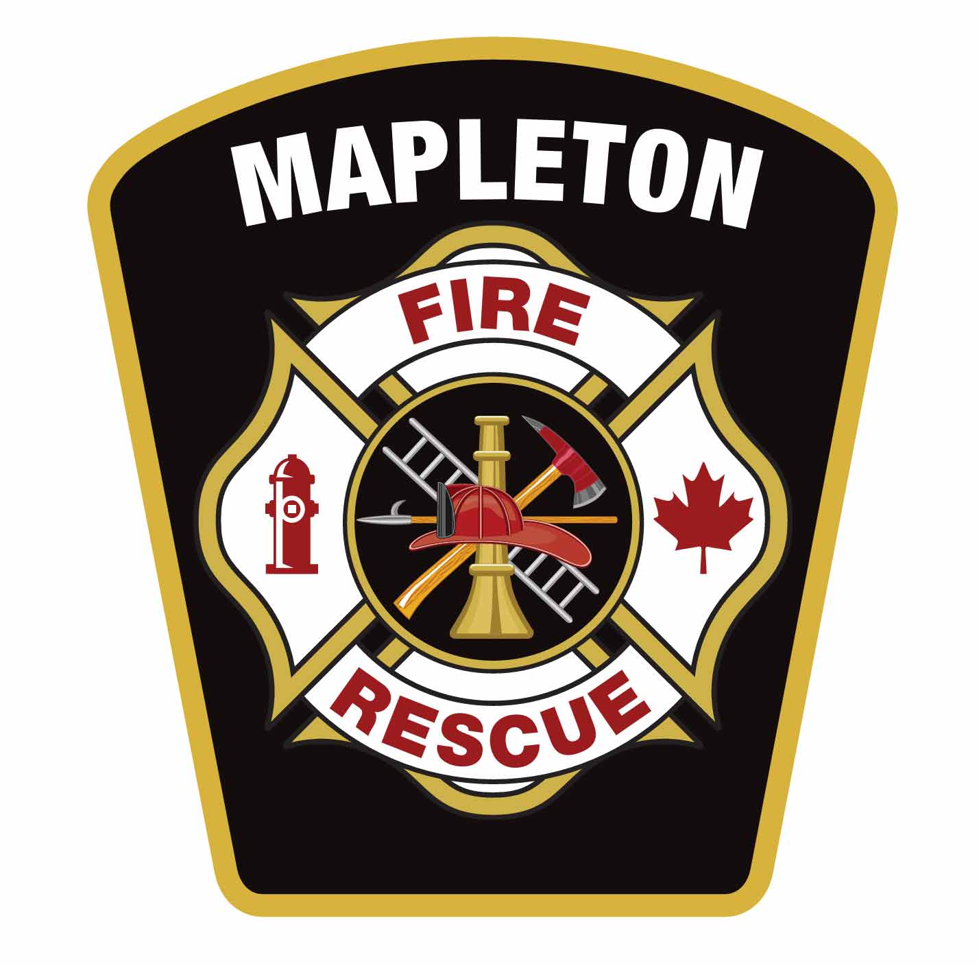
MAPLETON – Three different logos are used to represent the Mapleton fire department, and officials have decided it’s time to change that and streamline department branding.
“I know branding a fire department seems kind of weird,” said Fire Chief Chris Harrow during a Mapleton council meeting on Oct. 22.
“But we want to have one consistent logo that’s in the community so that when people see the logo they can respect it and say ‘that’s the fire department … I must remember to change my smoke alarms because I see that logo.’”
“It’s also important for us to have one logo for the fire department, so that when we work with different companies and different enterprises we can say, for example, ‘John Deere is a proud partner of Mapleton Fire because they donated to us’ and we can put their logo with our logo, and our logo will be known out and about in the community.”
Deputy fire chief Callise Loos helped design the new logo, and there was engagement with Mapleton firefighters, Harrow said.
“We got very positive comments back from the firefighters,” he noted.
Implementing the logo won’t be “a huge budget thing,” he said, but “over the years we are going to work at standardizing our logo and making sure that everything is consistent.”
This includes trucks, uniforms, stations and any printed or online presence.
“That is one sharp looking patch right there,” said Mayor Gregg Davidson.
“We absolutely need to be branding our fire department as well [as the township] and that patch is incredible.
“I’m glad that firefighters … endorsed this as well because it is very important for them to love the patch as well, not just us here.
“They have to love it, and that’s a very smart-looking patch.”
Council voted in favour of supporting the rebranding in principle.


