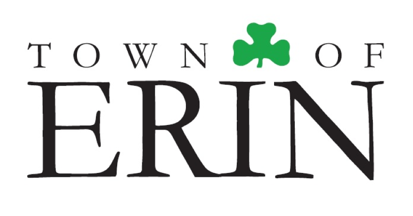
ERIN – After more than two months of controversy surrounding a new town logo, council has directed staff to immediately “retain the look and feel of the existing shamrock logo.”
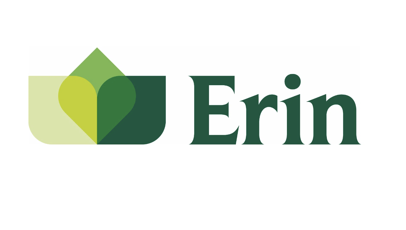
On Sept. 13 the town unveiled a new Erin logo in a social media post, just nine days after announcing a “brand refresh,” leaving many residents upset.
Many community objected via social media, with many stating they felt they had not been given a true opportunity to provide feedback on the town’s rebranding.
Others stated it was “shameful” to remove the shamrock completely, as it was “our town’s identity.”
Some wondered if the logo, designed by Trajectory Brands Inc., was a good way to spend $20,000.
Others still pointed out the new logo is nearly identical to several other logos already in use by companies in North America and beyond.
In the face of the significant backlash, council decided to pause the implementation of the new logo at an Oct. 10 meeting.
“We made a mistake in the process but … it was not a malicious mistake,” councillor John Brennan said at the meeting.
“It was not a mistake that was designed to avoid interacting with the public.”
After many discussions with residents, on Nov. 28 council unanimously agreed to advise staff to:
- retain the look and feel of the existing shamrock logo;
- work on creating a higher resolution version of the logo; and
- use the higher resolution logo for all municipal branding purposes.
“I think this is the way we should be going,” said Brennan, noting the previous logo is acceptable to “the public in general, but it also avoids cost.”

The Town of Erin unveiled this new logo on Sept. 13. Submitted image
Councillor Cathy Aylard urged councillors to be “crystal clear” about their intentions to avoid further confusion and discussion.
“We will immediately reinstate the previous version of the logo; we’ll take the time to create a cleaner version of it … that means there will be no further investment in this exercise,” explained Aylard.
Town chief administrative officer Rob Adams added, “In the course of the next month or so we would look at trying to get a clearer high-resolution image.
“The image has actually been distorted over time; the shamrock has moved off centre of the ‘i’.”
He also noted the letters “r” and “i” in “Erin” have bled together.
A higher-resolution version was recommended to enhance its usability across various platforms and materials.
“It just seems like we’re doing work twice,” said Mayor Michael Dehn.
Adams replied, “We’re not going to go and redo signs or anything like that, but the things we can easily do [such as] changes to our social media and changes to our emails we can do fairly easily.”
Aylard added, “It’s not a simple change, but it’s the easier change because it mostly just lives digitally.”
Council approved the recommendation unanimously and staff will begin the implementation of the previous logo across all digital and print materials.


